How to Hang Artwork: The Essential Glossary You Need
Ever walked into a room and felt captivated by the way artwork was displayed? Perfectly balanced, well-lit, and thoughtfully arranged—almost like a gallery?
Whether you're a seasoned collector or just starting, mastering the art of hanging artwork can transform your space. Mastering the art of hanging artwork isn’t just about putting nails in the wall—it’s about understanding the right hardware, spacing, lighting, and design principles to create a visually cohesive and professional display.
In this guide, we'll break down the essential terms and techniques you need to create a professional, polished display that enhances
This comprehensive glossary will introduce you to essential terms, expert tips, and techniques that will elevate your artwork presentation. Whether you're a beginner or an experienced decorator, this guide will help you avoid common mistakes and achieve a polished, balanced arrangement.
Topics Outline:
1.Hardware
Leveler Tool
Stud Finder
D-Rings
Wall Anchors
Frame Wire
Plaster Walls
2.Matting
Matting
3.Spacing
Negative Space
Two-Thirds Rule
Vertical Spacing
Overhang Clearance
4.Lighting
Natural Light
Artificial Light
UV Protection
Lighting Angles
5. Arrangement
Gallery Wall
Symmetry
Focal Point
Center Point
Proportion
Juxtaposition
6. General Principles
Eye Level
Seated Eye Level
Hanging Hardware: The Foundation of a Secure Display
Before considering placement and aesthetics, you need the right tools to ensure your artwork is securely mounted. Here are key hardware terms every art enthusiast should know:
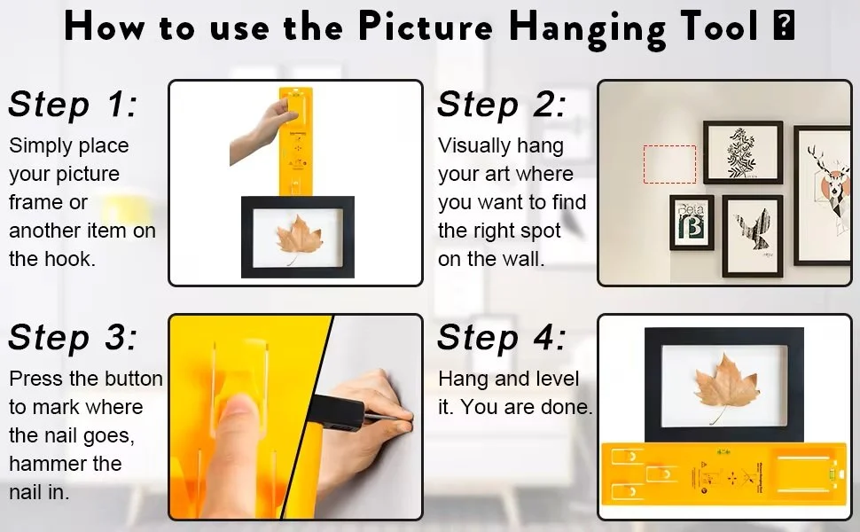
1.Leveler Tool
Definition: A must-have tool that guarantees your frames hang straight, preventing visual imbalance.
Why It Matters: Ensures ensure an object (such as a frame) is perfectly straight on the wall.
Related Key Terms: Alignment, precision, balance.
Pro Tip: Use a digital leveler for added precision.
2.Stud Finder
Definition: A handheld device that detects wooden or metal studs behind walls for secure hanging.
Why It Matters: Helps you mount heavier artwork on a strong support structure rather than just drywall.
Related Key Terms: Hardware, support, stability.
Pro Tip: For frames over 20 lbs, always secure them to a stud.
3. D-Rings
Definition: Metal hardware attached to the back of picture frames for hanging purposes, providing stability and preventing tilting.
Why It Matters: Prevents frames from tilting and keeps them flush against the wall.
Related Key Terms: Stability, hardware, installation.
Pro Tip: Use two D-rings for larger frames to prevent shifting.

4. Plaster Walls
Definition: A type of wall finish made from a mixture of water, sand, and lime, common in older homes.
Why It Matters: Requires special hardware for secure installation of artwork.
Key Terms: Surface type, durability, hardware.
Example Sentence: "The article suggests using anchors specifically designed for plaster walls to prevent damage during installation."
5.Drywall Anchors
Definition: Reinforced inserts used to secure screws in drywall when a stud isn’t available, providing additional support for heavier artwork or frames.
Why It Matters: Keeps heavy artwork stable without damaging the walls and ensures it stays securely in place.
Related Key Terms: Support, durability, wall anchors.
Pro Tip: Use toggle bolts for extra-heavy pieces.
6. Frame Wire
Definition: A flexible wire attached to the back of a frame for hanging purposes.
Importance in Interior Design: Allows for easy adjustment and secure mounting of framed artwork.
Related Key Terms: Installation, hardware, flexibility.

Now, let's discuss the importance of matting in enhancing the overall presentation of your art pieces.
Matting: Elevating the Look of Your Artwork
Matting
Definition: A decorative border, often made of cardboard or paper, placed around artwork within a frame.
Why It Matters: Adds depth, contrast, and protection by preventing the artwork from touching the glass. You can also use it to make a small piece of artwork visually larger.
Types of Mats:
Single Mat – Minimalist and clean.
Double Mat – Adds contrast with two layers.
Floating Mat – Makes artwork appear suspended.
Related Key Terms: Framing, presentation, conservation.
Example Sentence: "Matting the artwork in a light color helped it stand out against the dark wall, as suggested in the guide."
Pro Tip: Use acid-free mats to prevent artwork from yellowing over time.
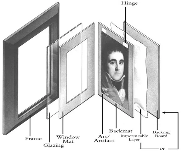
Matting provides a finishing touch to your art displays, elevating the overall look of your pieces by adding depth and visual interest. By framing your artwork with a mat, you create a border that enhances the focus on the piece while also giving it a more professional and polished appearance. Matting can also help protect your artwork from touching the glass if framed, preventing any potential damage or deterioration over time. Consider the color, size, and thickness of the mat to complement your artwork and showcase it in the best light.
This attention to detail in matting will enhance the overall presentation of your artwork, setting the stage for a professional and polished display that captivates viewers and showcases your pieces in the best possible light. Consider the impact of matting on your art displays as you move forward in creating gallery-style perfection. The next step in achieving a flawless art display is understanding the importance of spacing to ensure each piece is showcased effectively and harmoniously.
Spacing: Achieving the Perfect Arrangement
Proper spacing ensures your artwork looks intentional, balanced, and visually pleasing.. The distance between each piece should be carefully considered to ensure that they complement each other without feeling crowded or disjointed. Adequate spacing allows each artwork to stand out on its own while still being part of a cohesive collection. By paying attention to spacing, you can create a visually pleasing arrangement that enhances the overall impact of your gallery-style art display. Moving forward, let's explore how lighting can further enhance the presentation of your artwork.
Negative Space
Definition: The empty area surrounding a design element, such as artwork, which helps highlight the piece.
Why It Matters: Creates a clean, open feel and enhances the focus on each piece. Negative space avoids overcrowding, making the design feel more open and harmonious.
Related Key Terms: Spacing, minimalism, simplicity.
Pro Tip: If a wall feels cluttered, remove one piece and see how the arrangement improves.
2. Two-Thirds Rule
Definition: A design principle stating that the width of an artwork or decor item should be roughly two-thirds the width of the furniture it hangs above.
Why It Matters: Maintains proportion and visual harmony in a room.
Key Terms: Proportion, balance, symmetry.
Example: If your sofa is 90 inches wide, your artwork should be around 60 inches.
3. Vertical Spacing
Definition: The distance between the top and bottom edges of adjacent pieces in a gallery wall or arrangement.
Why It Matters: Ensures consistency in gallery walls or multiple-piece arrangements.
Key Terms: Symmetry, arrangement, alignment.
Pro Tip: Maintain 4-6 inches of vertical spacing between frames for a cohesive look.
4.Overhang Clearance
Definition: The distance between the bottom of an artwork and the furniture or mantel below it.
Importance in Interior Design: Prevents artwork from appearing cramped or disconnected from the space.
Key Terms: Placement, proportion, cohesion.
Example Sentence: "The article suggests leaving 6–8 inches of overhang clearance when hanging art above a bed."
Lighting: Showcasing Your Artwork Like a Pro
Lighting is one of the most overlooked aspects of art display. The right light enhances colors, textures, and details, creating a dynamic and engaging presentation. Whether you choose to use natural light, track lighting, or accent lighting, the key is to ensure that each artwork is well-lit and showcased in the best possible way.
Moving forward, let's explore how lighting can further enhance the presentation of your artwork and set the stage for creating a cohesive and visually pleasing arrangement that showcases your collection in the best light possible. This will ensure that your gallery-style art display is not only polished and professional but also captivating and impactful.
Natural Light
Definition: Sunlight that enters the room through windows or skylights, which can enhance or diminish the visibility of artwork depending on its placement.
Why It Matters: Changes throughout the day, affecting how artwork appears.
Key Terms: Sunlight, positioning, exposure.
Pro Tip: Avoid direct sunlight to prevent fading—UV rays can damage delicate pigments.
2. Artificial Light
Definition: Light provided by fixtures such as sconces, track lighting, or picture lights, specifically aimed at illuminating artwork.
Why It Matters: Artificial lighting ensures consistent visibility of artwork, especially in rooms with limited natural light or during evenings.
Key Terms: Sconces, track lights, illumination.
Pro Tip: Use LED lights—they don’t emit heat or UV rays that can damage artwork.
3. UV Protection
Definition: A coating or film applied to glass or light sources to block ultraviolet rays that can damage artwork over time.
Why It Matters: Protects sensitive materials like paper, textiles, and certain paints from fading or discoloration.
Key Terms: Preservation, durability, coating.
Pro Tip: Museum glass with UV filtering is the best option for artwork longevity.
4. Lighting Angles
Definition: The direction and angle at which light hits the surface of the artwork.
Why It Matters: Prevents glare and enhances visibility.
Key Terms: Glare reduction, shadow control , focus.
Pro Tip: Keep light sources at a 30-degree angle to minimize reflections on glass-covered pieces.
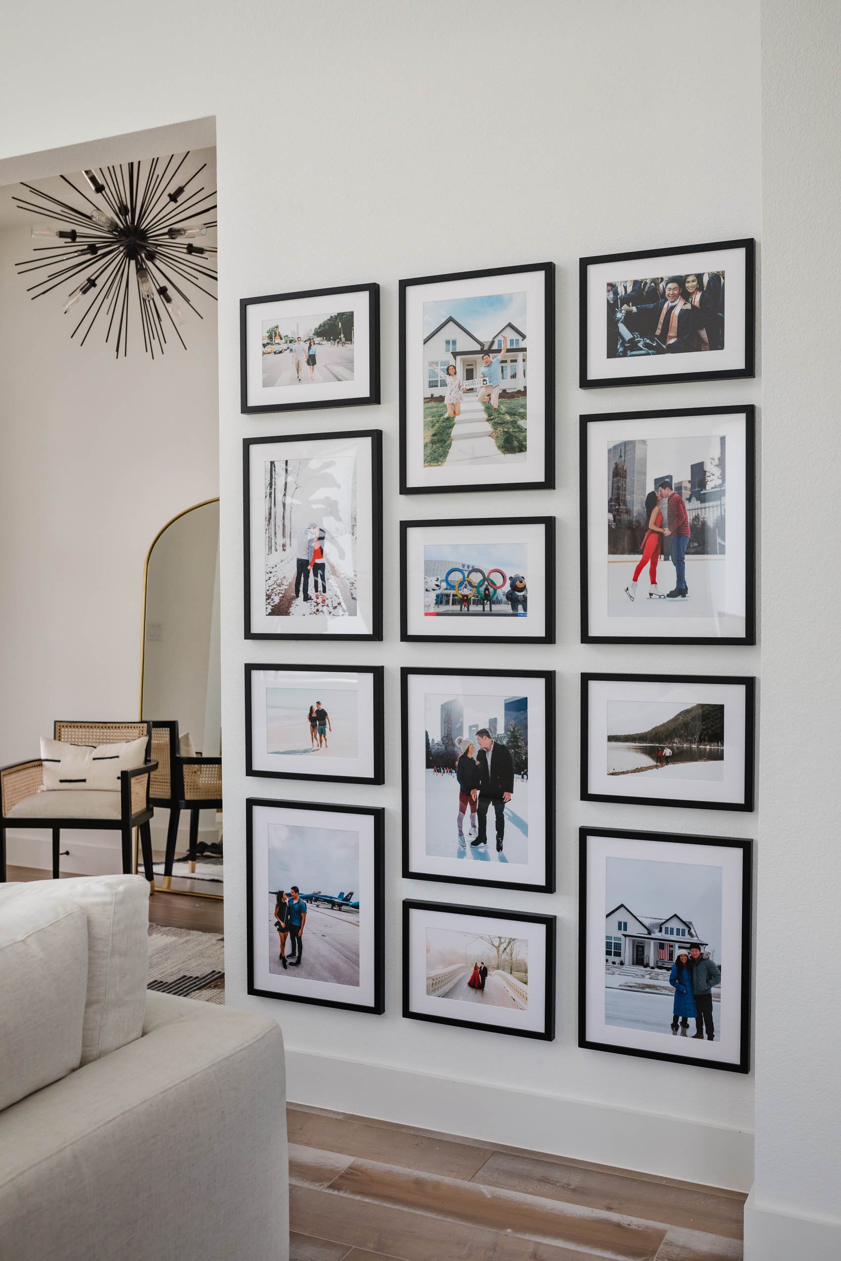
Arrangement: Designing a Cohesive Art Display
1. Gallery Wall
Definition: A curated collection of framed artwork arranged in a structured or freeform style.
Why It Matters: Adds character and visual interest to a space.
Pro Tip: Use paper templates before nailing to test different layouts.
Related Terms: Collage wall, art grouping, symmetry.
2. Symmetry
Definition: A balanced arrangement where artwork is evenly distributed around a central axis.
Why It Matters: Creates a sense of order, harmony, and visual stability, making the display feel intentional and polished.
Pro Tip: Use symmetry for formal or classic interiors—pair artwork in even numbers or mirror-image layouts for a refined look.
Related Terms: Balance, proportion, alignment.
3. Center
Definition: The focal artwork that draws attention in a multi-piece arrangement.
Why It Matters: Serves as the anchor for the entire display.
Pro Tip: Place the most visually striking piece at eye level to naturally attract attention.
Related Terms: Focal point, symmetry, balance.
4. Proportion
Definition: The relationship between the size of an artwork and its surrounding elements, such as furniture or wall space.
Why It Matters: Ensures that artwork doesn’t feel too small or overwhelming in a space, maintaining visual harmony.
Pro Tip: Follow the two-thirds rule—artwork should be about two-thirds the width of the furniture below it for a well-balanced look.
Related Terms: Scale, balance, spacing.
5. Juxtaposition
Definition: The intentional placement of contrasting elements—such as colors, styles, or sizes—to create visual interest.
Why It Matters: Adds depth, energy, and uniqueness to an art display by mixing different artistic styles or unexpected pairings.
Pro Tip: Combine modern and vintage pieces or mix abstract and realistic artwork to create a dynamic composition.
Related Terms: Contrast, eclectic design, visual impact.
General Principles
1. Eye Level
Definition: The standard height at which artwork is placed for optimal viewing, typically around 57-60 inches from the floor to the center of the piece.
Why It Matters: Ensures that artwork is positioned where it’s most naturally viewed and appreciated.
Pro Tip: Maintain a consistent eye-level height throughout a space for a cohesive gallery feel.
Related Terms: Placement, alignment, viewing comfort.
2. Seated Eye Level
Definition: The adjusted height for artwork placed in areas where people are primarily sitting, such as dining rooms or lounges.
Why It Matters: Keeps artwork comfortably viewable from a seated position, preventing it from feeling too high or disconnected from the space.
Pro Tip: In seating areas, lower artwork to 48-52 inches from the floor to the artwork’s center for ideal viewing.
Related Terms: Comfortable viewing, placement, spatial awareness.
Final Thoughts: Elevate Your Space with Intentional Design
Mastering these art hanging techniques allows you to transform any space into a gallery-worthy display. From choosing the right hardware to perfecting spacing and lighting, every detail matters.
🔹 Remember: Experiment with different layouts, stay mindful of proportions, and let your creativity shine!
Now that you know the secrets to a perfectly curated art display, it’s time to put them into action! Try arranging your favorite pieces using these tips and share your setup in the comments. Need help with placement? Check out our guide on Foolproof Ways To Choose The Right Heights To Hang Artwork to ensure every piece is positioned perfectly!